
Rol
UI Architect
Type
UI Design System, Design Operations (Design Ops) & Rapid Prototyping Kit.
Year I Duration
2026 I 2 Months
Mosaico
Scalable UI Design System & Component Architecture
Mosaico v3 is a comprehensive, production-ready UI Design System built from the ground up in Figma to serve as a foundational engine for rapid wireframing, prototyping, and new product design. Created to eliminate repetitive setup work across projects, Mosaico v3 bridges structural consistency with ultimate design flexibility. Built around interconnected Figma variables, a 4px spatial grid system, semantic color palettes, and advanced component sets, the system provides a scalable framework designed to evolve continuously as new UI modules, sections, and brand requirements are introduced.
The Challenge
When launching new projects, design teams frequently waste valuable hours recreating fundamental UI patterns—such as buttons, form controls, typography scales, and responsive card layouts—from scratch. Without a unified, variable-driven design system, early-stage wireframes and prototypes quickly become inconsistent.
Color values are hardcoded, typography scales drift across screens, and updating a global brand style or dark mode theme requires manual, error-prone edits across hundreds of frames. Furthermore, traditional design kits often lack a clear mathematical foundation for spacing, padding, and component states, creating friction during developer handoff.


Goals
To solve these systemic workflow bottlenecks, Mosaico v3 was engineered around three core principles:
1
Establish a single source of truth in Figma using native variables for colors, spacings, radii, and typography tokens.
2
Build a modular, interconnected library of atomic components and complex UI patterns for rapid, high-fidelity wireframing.
3
Ensure long-term scalability, allowing designers to easily extend component variants, section templates, and theme modes without breaking existing layouts.
Research & Industry Benchmark
To determine the scope and architecture of Mosaico v3, we conducted a targeted audit of leading UI kits, design systems (such as Material Design, Polaris, and Tailwind UI), and widely used Figma section libraries. Through hands-on experience starting new digital projects, we identified a recurring pain point: many existing libraries are either overly bloated with niche, single-use UI patterns or lack the foundational flexibility needed for early-stage structural wireframing.
Our research focused on analyzing component usage frequency across real-world product workflows and wireframing sprints. Furthermore, industry studies on design system efficiency show that implementing standardized typography tokens (preset font sizes, line heights, and responsive scales) alongside variable-driven button states accelerates prototyping speed by up to 30%.
By mapping out these essential patterns and eliminating low-utility clutter, we defined the exact set of high-impact components, spatial variables, and font tokens required to streamline project setup and drastically speed up the transition from low-fidelity concepts to interactive prototypes.
Foundations & Token Architecture
The architectural core of Mosaico v3 is built upon a strict token structure categorized into Primitives, Spacings, Radius, Strokes, and Color Collections:
1 / 3
Spatial System & Padding Tokens
Built on a precise 4px grid system, spacing values scale systematically from spacing-none (0px) up to spacing-48 (48px / 3rem).
Section padding tokens (section-padding-sm at 48px to section-padding-lg at 128px) ensure predictable vertical rhythm across desktop and mobile views.

Component Engineering & Atomic Design
Using an Atomic Design methodology, Mosaico v3 organizes components from foundational controls up to complex interactive patterns:
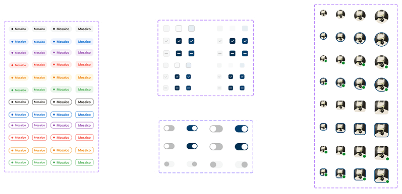
Atoms & Form Controls: Includes multi-state Avatars (supporting profile images, initials, and status indicators), Checkboxes, Radio Buttons, Toggles, and Badges designed to communicate status across various brand accents.
Button Matrix: Comprehensive button system structured into Primary, Secondary, Tertiary, and Link Buttons. Each tier supports multiple sizes (Large, Medium, Small, XS), icon placements, and interactive states (Default, Hover, Disabled).
Form Inputs & Dropdowns: Advanced dropdown components engineered with selectable values, inline icons, hover highlights, and multi-option select lists.
Molecules & Organisms (Cards & Accordions): Flexible container surfaces including Default Cards, Number Cards, and Image Cards with overlay gradients. Accordion components are engineered to organize dense content into collapsible sections, improving scannability while maintaining accessibility.
Atom Elements
Button Matrix

Form Inputs & Dropdowns

Molecules & Organisms

System Flexibility & Future Evolution
Mosaico v3 was designed not as a static kit, but as an adaptable foundation that grows alongside product needs. Because every component is tied directly to global Figma variables—such as spacing-4, radius, or colors/primary—switching a prototype’s visual theme, adjusting component density, or adapting a wireframe for a new client identity takes seconds rather than hours.
The modular architecture makes it simple to plug in new section layouts, data tables, and custom interactive components over time without fragmenting the underlying library.
Next Steps
The continuous roadmap for Mosaico v3 focuses on:
Dark Mode & Theming Expansion: Adding dedicated dark mode variable modes across all background, border, and text tokens for instant one-click theme switching.
Interactive Component Variants: Enhancing component sets with native Figma interactive prototyping states (hover animations, accordion expansion, dropdown toggles).
Webflow & Code Token Mapping: Aligning variable naming conventions directly with CSS custom properties (var(--spacing-16), var(--primary-400)) to streamline handoff to Webflow and front-end development teams.